
I love data. I love charts and graphs and tables. I love how discrete points of information can come together visually to tell a compelling story. I also love baking. I love pies and cakes and cookies. I love how flour, sugar, and butter can come together to form a myriad of tasty treats. Combining these two passions, I like to think of dashboards in DRVS similar to showstoppers from the Great British Bake Off.
 If you haven’t watched the show, showstoppers are the final challenge contestants face each episode. Contestants must combine their technical baking knowledge with creativity to produce final products that taste—and look—incredible.
For those unfamiliar with DRVS, dashboards are data visualization tools that allow you to tell a story with your EHR, HIE, or plan data. While easy to create, dashboards require an understanding of both the underlying data and what story you are trying to tell.
Before even setting foot in the kitchen or the dashboard administration, you first want to think of your audience. Who is going to be eating this dessert? Who is going to be looking at this data? A treat you make for a work party may be different than something you create for a holiday get together with family.
With the former you want something easily shared and without much need for plates or utensils; with the latter you usually want something corresponding to the season (like pumpkin pie at Thanksgiving) and with a little something special—whether it’s an old family recipe or a fun decoration. Similarly, a dashboard you make for care teams to review their performance may have a different layout than something that’s shared with organization leadership.
With a care team focused dashboard, you want something actionable and tailored to a specific provider or site. With an executive-level dashboard, you typically want aggregated data that shows high-level trends. Whether a dashboard or a dessert, thinking about the audience will help guide your next steps.
Now it’s time to start baking and building! Think about the different ingredients and data points you can leverage to create a show-stopping result. If we break it down to its basics, most baked goods contain flour, sweetener, fat, and leavening agents in specific proportions. These building blocks of baking are similar to the widgets available on a dashboard. In the baking world, balanced ingredients create delicious outcomes. Too much flour, it comes out dry; too little leavening and it comes out flat. In DRVS, a variety of widgets create a meaningful landscape for your data.
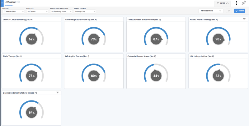
Take the dashboard below; these nine-gauge widgets don’t offer compelling insights—a scorecard would be better suited to display this information. Building a variety of widgets into your final product makes your dashboard more compelling and broadly usable.
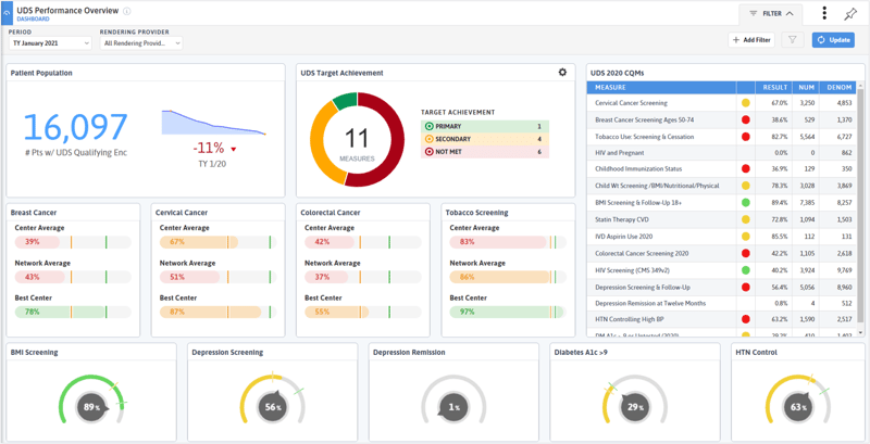
Compare the above dashboard to the one below. The latter looks at the same information (UDS measure performance) but is much more compelling with the variety of widgets and the addition of targets. In this dashboard, you can quickly compare practice performance on key metrics to that of the network and see a summary of all measures and target achievement.
Once you start baking, you typically follow a series of predefined steps in a specific order and timeframe; and varying from the recipe can lead to disaster in the kitchen. However, unlike baking, dashboards are not a science. With dashboards, you have the flexibility to play around with filters and grouping options, adding and deleting widgets, and varying the measure components. And unlike baked goods, there’s no set time for a dashboard to be “done”. Dashboards can grow and develop as your programs develop.
After creating a dashboard one day, sleep on it, and come back the next day to review the data, layout, and story of the dashboard. What jumps out to you with fresh eyes? What do you want to change? Maybe ask a colleague for their opinion on the dashboard. Creating a dashboard does not have to be a solo endeavor!
While I may not be the world’s best baker or dashboard builder (Azara’s Chief Technology and Product Officer, Greg Augustine, may hold that title–the dashboard part at least) here are some of my tips and tricks when it comes to creating a meaningful dashboard (and a tasty dessert!):
- Know Your Audience – By thinking about who is going to be using and viewing the data before even building the dashboard, you can elucidate the types of data points and widgets you will need.
- Be Patient – You can’t frost a still warm cake and you can’t expect a perfect dashboard in 30 minutes! Take your time to build the dessert or dashboard that makes the most sense for your needs.
- Have Fun – Let your creativity take the driver’s seat when it comes to developing desserts and dashboards. Play around with different spices and don’t worry about breaking DRVS or irreparably changing your data. DRVS won’t change any of the underlying EHR data, so you can feel confident playing around with filters, groupings, and more!
While dashboards and baking may seem like insurmountable challenges at first, the more time you spend creating and experimenting, the easier it will become. If you have any showstopping dashboards or desserts (or want some of my favorite recipes), please let me know at molly.wack@azarahealthcare.com.
Related Articles

From Release to Recovery: Closing Care Gaps for Justice-Involved Populations
Explore Insights
Turning Every Encounter into Value: How Azara's EHR Plug-In Elevates Risk Adjustment at the Point of Care
Explore Insights