Health Plan claims data is a key piece in the jigsaw puzzle that represents patient data in our healthcare system. Without the ability to interpret and incorporate claims data, you’ll forever be checking under the metaphorical couch cushions for that missing piece. The truth is, utilizing claims data is more complicated than this metaphor allows. Claims data offer rich utilization and cost metrics that usually are not present in other patient datasets. Yet, claims-based datasets are often challenging to work with and require quite a bit of knowledge to unlock. This blog series will chip away the enigma by offering concepts that will help you find, and fit, those troublesome puzzle pieces.
To start, we need to describe some core attributes of this mysterious “claims data” concept. For the sake of simplicity, we’re going to focus on medical claims here. Let’s trace a claim record from point of care, through Azara receiving the record.
After services are rendered, a claim is submitted from the provider to a health plan. This transfer of data is essentially the provider’s request for payment for services they have rendered. Next, the health plan adjudicates the request and determines the payment amount, if any. At this point, the claim record is sitting in the health plan’s data warehouse. Azara typically receives monthly claims files directly from our health plan partners. These files consist of records as they exist in their internal data warehouse.
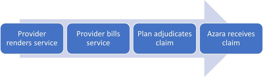
It is important to consider the time between each of these steps. Depending on the health plan, a provider may have up to a year or more to bill for their services rendered—though in most cases a provider will bill for their services immediately. However, it is important to acknowledge that a small number of services may not enter this data pipeline until many months after the services are rendered.
Once a health plan receives a claim, it may take weeks or months to adjudicate. In the most complicated cases, claims will be denied, appealed, resubmitted, and re-adjudicated. I’ll cover what this process looks like in a future blog, but keep in mind that this process can add a significant amount of time to this data flow.
The last step of the data telephone game involves the health plan sending Azara claims files, which typically occurs monthly. If we consider the claim we’ve been tracing above, Azara has likely received the claim for that service about 90 days after the service was rendered by the provider. Claims are anything but timely.
Let’s step back and look at the big picture. There is a term called “claims lag” that is used to describe the time period between when a service is rendered and when that claims data is available for analysis. The industry standard for claims lag is about 90 days. However, there can be a lot of variances, so it’s important to understand what that gap really looks like plan by plan. Essentially, we’ll be asking the following question: “How complete is my data?”.
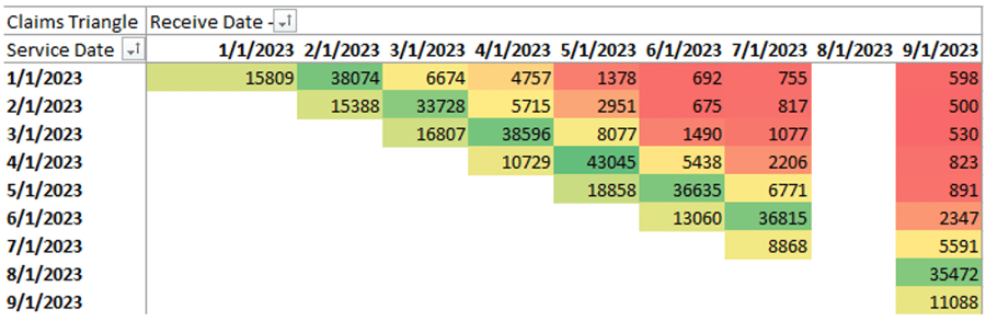
To do this, I’ll introduce the concept of a claims triangle. This is a tool that is typically used by a health plan’s actuaries to assess their own financials. However, we can borrow some of its basic concepts to help understand how complete our data set is. In the example below, rows represent service dates and columns represent the date Azara received the claim. The number where they meet represents a count of claims. I’ve also added a heatmap to help highlight patterns. We’ll start with synthetic data so we can get a feel for what we’re looking at.
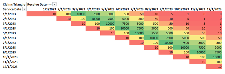
To help read this chart, let’s look at some example cross tabs. If we look at the first row, representing services rendered in January 2023 and read across, we see there were 10 claims received in January 2023, 100 in February, and 10,000 in March. This illustrates that the majority of the claims for a given service date are received 3 to 5 months after the service date.
The above visual represents an ideal scenario, so let’s play with some common scenarios. I’ll continue to use synthetic data for the next two examples and then we’ll look at real health plan data.
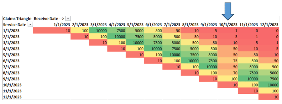
Looking at the above example, it seems that something strange has happened on the file we’ve received in October. Looking down the column for an October received date, we clearly received data, but the volume doesn’t appear to fit the month over month pattern we’re used to. This is a fairly common scenario and usually means there is something wrong with a particular file we’ve received. In this case, Azara will work with the health plan to ensure that we’re receiving all of the necessary claims data.
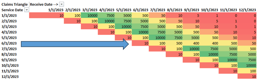
The next situation (shown above) is a little different. By reading across columns, we can see there’s an anomaly for services rendered in June 2023. This pattern tells us that we have a problem with a certain rendering period, and we need to work with the health plan to ensure we’re getting all of the relevant data for a given service month. In some cases, this might be a legitimate pattern due to logistics that we may not have full insight into, such as plan-provider credentialing changes. Incidentally, these are the same patterns we observed during the early months of the COVID-19 pandemic.
Okay, enough of painting a very structured picture. Let’s look at some real claims data patterns.
Notice the missing month? This is where Azara would identify a missing file and work with the health plan to obtain the missing information. However, I didn’t just show you this to drill the same point home. I want to take you a step deeper. To do so, we will switch the lens we look through to get a bit of a clearer picture, sort of like that machine of lenses at your eye doctor. (That mask of lenses is called a phoroptor by the way.)
Let’s try to answer the very common question: “How long do I have to wait for a month of claims data to be complete enough for your analysis?”
Looking through our phoroptor, we’re going to switch to a new lens. Here is the same triangle, except now we’re looking at counts as a percentage of that row (rows = service month).
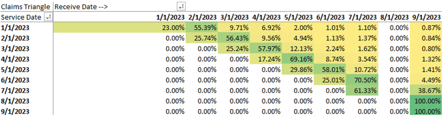
Does it look better with #1 or #2? Jokes aside, let’s focus on the service months from January 2023 through March 2023. We can tell that we receive about 25% of our claims the month of the service. We then expect to get about 55% of the claims the following month, followed by an additional 10% the month after. There will always be a few months of straggling claims, but we approach 99% about 4 or 5 months afterwards. Again, this is the concept of claim lag.
The truth is that by the time a month’s worth of data is fully complete, its value has waned significantly. The name of the game here is to find a level of completeness that we’re comfortable with while the data is still relatively recent. In this case, I’d argue that we have sufficient data to make data driven decisions after about 4 months.
To fully utilize health plan claims data, we need to understand what data we do not yet have.
Admittedly, there are 2 or 3 more stories I can drum up from just this claim triangle. I encourage you all to look at your own claims data (or contact your friendly neighborhood Azara data geek!), to see what your claims triangle tells you. The act of profiling claims data as I’ve begun to describe here is a key part of the initial work that goes into onboarding health plan data into Azara’s Cost and Utilization (ACU) application.
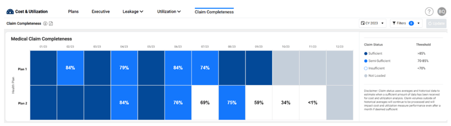
ACU actually includes a simplified version of the claims triangle, so you can understand your own data completeness and be clear on what your analysis represents. In this simplified approach, we allow users to look at their completeness across all health plans in a single widget where the columns represent months based on date of service. Each month is then color coded based on completeness level. The concept of completeness is woven throughout ACU using these colored categories, so that users know the status of the data before any decisions are made.
In closing, I’d like to offer an answer to the question posed in the title. One of the reasons why claims data is difficult to work with is because it tends to be incomplete. To fully utilize health plan claims data, we need to understand what data we do not yet have.
To offer yet another metaphor, we’re staring at Rorschach inkblots while trying to find meaning in the white space, the gaps between the ink. Armed with tools like the claims triangle and a few different lenses to peer through, you can find the beauty between the ink. In future episodes of this blog series, we’ll dive into additional concepts and find more of those missing puzzle pieces.
Read Part 2 and 3 of the Blog Series:

Related Articles

From Release to Recovery: Closing Care Gaps for Justice-Involved Populations
Explore Insights
Turning Every Encounter into Value: How Azara's EHR Plug-In Elevates Risk Adjustment at the Point of Care
Explore Insights