
The current pandemic has brought discussions of racial and ethnic disparities in healthcare to more mainstream conversations. I have heard the term “social drivers of health” (SDOH) from more news outlets in the past year than ever before. As I have written about in previous blogs, social drivers of health are not some novel, new lens from which to view health outcomes, but are instead an ever-present component of care for many community health workers.
What we at Azara are faced with is how to make information on social drivers of health easily viewable, understandable, and most importantly, actionable. Asking a patient to fill out yet another lengthy, personal questionnaire and then having to manually enter the data if it was done on paper can seem like one too many things to tack on to an already over-full day; but this information brings important context to so much of what drives a patient’s health. In this blog, I want to explore how breaking down these different triggers can help deliver better care.
SDOH Triggers
Azara bases its reporting in DRVS off the PRAPARE template, a nationally standardized SDOH screening tool used by the majority of our clients. While we can accommodate other screening tools, we always map to the questions and positive trigger responses outlined in the PRAPARE assessment. This allows us to identify patients with positive triggers such as housing, utilities, food, transportation, etc. (for the full list, see the PRAPARE website or the DRVS Help section).
These triggers include a mixture of personal characteristics (race, ethnicity, language, veteran, refugee) and material/circumstantial (food, clothing, insurance) triggers. Both categories are important but serve different purposes. I think of personal characteristics as a starting point in answering questions about whether disparities exist at the highest level—race, ethnicity, language, veteran and refugee status can offer a broad strokes indication of whether different populations experience different access to care.
In DRVS, we split out what we call the “actionable” triggers, like food, clothing, insurance, etc. from the personal characteristics because there is no action to be taken to change or address someone’s race, but there would be to provide them with a reliable source of food.
Getting this data is challenging—not every patient is screened, and even those who are often do not complete the questionnaire. There are ways in DRVS to try to normalize this data—we show overall screening rates, as well as the rate of a “Core +1” screening that indicates of all the patients who were screened, how many responded to the “core” SDOH questions (food, housing, transportation, and utilities) plus at least one other question. But we hear time and again from our clients that asking these questions is difficult, for patients and care teams, and screening everyone is not realistic for most practices.
Using SDOH Data in DRVS
What I present below is an example of how to use this data, no matter how much of it you have, to lend some perspective on why it is important and hopefully take action. I created a custom dashboard to compare cancer screening rates by race and went through several iterations before arriving at what I have below:
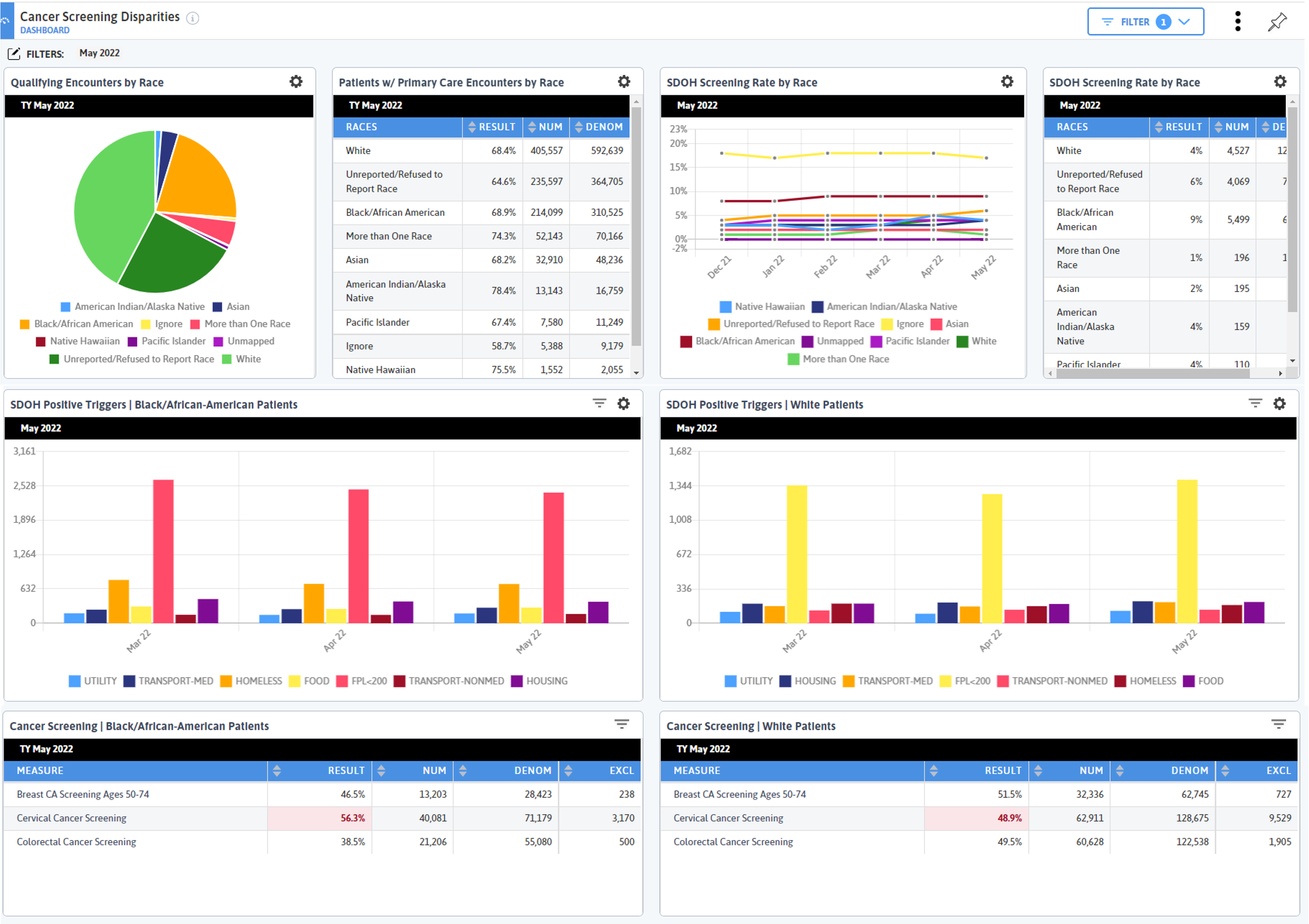
While this dashboard is about cancer screening disparities, most of the widgets are here to provide context. I want to drive home the importance of this—there is so much data in DRVS, and unless you set the stage to tell a cohesive story, it’s easy to get lost in what you are looking at.
This is also why it took me several tries to get this dashboard where I wanted it—I kept building widgets, re-telling the story, then tweaking until I got exactly what I needed. That is why dashboards are the most complex functionality to build in DRVS, but also one of the most rewarding and impactful.
Identifying Your Population
My first row is about broad strokes disparities—I need to first understand who the population is that is seeking care, broken down by race (I am looking at this from a network level).
 The largest body of patients is White, then Black/African American, then every other race which have populations below 100,000 (use the gear icon to easily toggle back and forth between a pie chart and table to see numbers).
We also have a large (second highest) portion of the population that has a race of Unknown/Refused to Report. This is significant and raises questions about the value of such a grouping and how we identify patients’ race. But we also know that race in America is a disturbing indicator of health outcomes, so even knowing the caveats of having such a high unknown/reported bucket, I am going to continue to compare by race.
Primary Care Encounters by Race
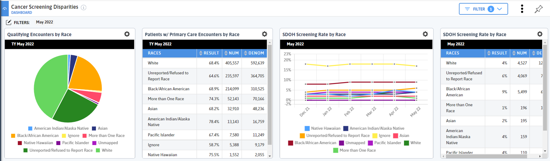
 My next widget (top row, going right) is looking at primary care encounters by race. This widget gives me slightly different information than the first. My first widget tells me the number of patients who had a qualifying encounter in the trailing year period; my second tells me out of all the patients who had a qualifying encounter in the last 18 months, how many and what percent had a primary care visit.
Since I am eventually going to be looking at cancer screenings, which are initiated in a primary care setting, I am interested in my population seeking primary care. And I can see that while Black/African American patients make up a much smaller number of patients with qualifying encounters, they have a slightly higher rate of primary care encounters. There doesn’t appear to be an obvious access issue with primary care visits, though if I dug a little deeper, I could find other, more specific trends and metrics (encounters per patients, no show rates, etc.).
Next, I look at SDOH screening rate by race. Ignore is the highest screening rate (though with a much lower denominator), then Black/African American. I know from my previous widgets that the Black/African American population is second largest, and that group is coming in for primary care visits at roughly the same rate as White patients (the most comparable group from a volume perspective), so it is interesting that Black/African American patients have the highest screening rate. I remember a former member of our team who used to work at a health center in Boston once looked at similar data to this and said, “We would often not think to screen white patients for SDOH because we assumed they didn’t have as many positive triggers as non-white patients.”
This type of unconscious bias likely exists for many, many practices, and it is important to note, both from a patient experience perspective as well as a data quality concern. Thinking about your own practice’s workflows, do you tend to screen more minority patients, and if so, why?
Based on the data in my first row, I know that Black/African American and White patients make up most of the population. Note that other populations are also important to examine, but given the difference in populations, I am going to focus on White and Black/African American patients as a point of comparison for the next two rows then make additional dashboards to compare other races.
SDOH Screenings by Race
In my next row I group patients who completed the Core + 1 SDOH screening (see above for Core +1 definition) by SDOH positive trigger and then split those graphs by White and Black/African American. I decided to restrict the SDOH triggers on these widgets using filters because I want to hone on actionable triggers and I first notice that FPL <200 is the most prominent positive triggers for both groups, which is pretty typical of what we see for many of our clients and networks. Note: in DRVS, the colors of the bars do not necessarily match between widgets, so pay attention to the labels when comparing data on widgets with groupings!
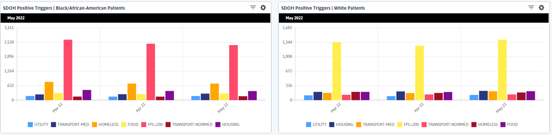
When we look at the next largest column, there are ~5 times as many patients identifying as homeless who are Black/African American as there are White patients. Remember, we have a higher rate of screening among the Black/African American population, but we also have a larger overall White population, so we need some additional context about what the ~500 more Black/African American patients who triggered positively for homelessness compared to White patients means.
If we look at our total population of patients who have completed the Core +1 screening and determine the rates of homelessness among that population (note that you currently need to manually calculate these rates in DRVS—see the end of this post for detailed steps on how I did this) we find that the overall rate of homelessness among patients who complete the Core +1 is 14%, but among White patients is only 6%, and among Black/African American patients is 18%.
I did these calculations to validate that the bars I am seeing in my visual are telling me the right story—since they express a number, not a percentage, I want to be sure I am not just interpreting that a larger number of Black/African American patients are homeless because more of them have been screened. But my calculations prove that the rate of positive homeless triggers is much higher for Black/African American patients than for White patients. When I did my calculations, I only used those who had completed the Core +1 screening, so I feel confident in my numbers and interpretation. The same holds true for the positive Housing trigger.
SDOH and Improving Cancer Screening Rates
So what does this have to do with cancer screening? In my final row, I see that Breast Cancer Screening rate is lower for Black/African American patients than White patients by ~5%, and Cervical Cancer Screening rates are almost 8% higher for Black/African American patients.
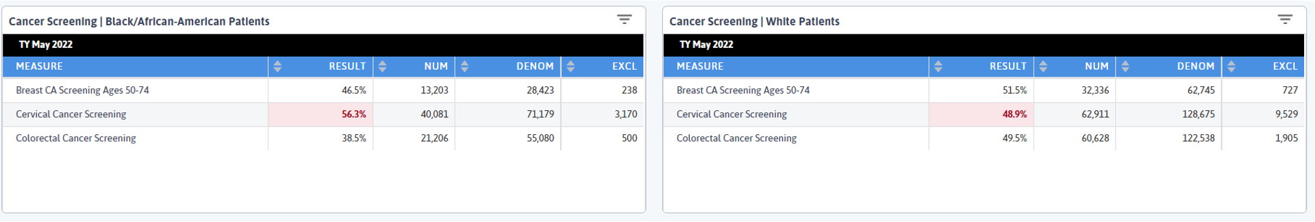
What drew my eye was the Colorectal Cancer Screening rates. According to the CDC, Black/African American patients have the highest rate of new colorectal cancer cases, and here we can see that group has a 11% lower Colorectal Cancer Screening rate than White patients. In the context of the SDOH data we reviewed, how can we think about how to address this disparity?
Both cervical and breast cancer screenings take place in an office or hospital and do not require patients to do anything in their home. Mammograms are often done at an imaging center or hospital, though some practices have machines or vans that come periodically. Many PCPs can conduct pap smears in house, and we saw earlier that Black/African American patients are coming in for primary care visits at slightly higher rates than White patients, so the opportunity for paps and mammogram referrals is there.
But colorectal cancer screening either requires patients to bring home a kit or schedule a colonoscopy and prepare at home the night before the procedure. This would be very difficult to do if you are living in a shelter, on the street, or have other housing concerns.
How can we make this process easier for patients experiencing homelessness or housing issues? As our beloved former friend and colleague Heather Budd would say, “Have you considered the poop on demand model?” Whenever we were working on a project with a client together and considering ways to help a practice improve colorectal cancer screening rates, she would always make this suggestion and when I saw the data here, I immediately thought of her.
In this instance, could you prepare patients ahead of time that they need to give a sample in the office? Could you work with local homeless shelters to distribute kits and have a regular pick-up there?
What Have We Learned
Is this the whole story? Certainly not. Patients are complex, our healthcare system is complex. But in this sea of information, I see a thread on which to pull—a concrete take-away that could help some patients have an easier experience and help increase this potentially life-saving screening. I am making a hypothesis, but this should be challenged and corroborated through patient discussions. What is all this data here to do if not be questioned, explored, presented, then questioned again?
We continue to work on ways in which DRVS data can be used to support the new CMS Framework for Health Equity and have some exciting partnerships underway. One of the reasons I decided to write this blog is thanks to the work we are doing with the Harvard T.H. School of Public Health and their Implementation Science Center for Cancer Control Equity. We are currently piloting new measures for abnormal FIT, cervical, and breast cancer screening results and follow up. If this is something your practice or network is interested in, please submit a support ticket at support@azarahealthcare.com.
As always, I want to thank our amazing clients for the work they do in highlighting the importance of social drivers of health; it is paving the way for broader conversations across the industry and pushing everyone to consider this new paradigm in healthcare.
Calculations:
- All Patients
- 9,152 patients completed Core +1 screening (numerator of the Social Drivers of Health Core Criteria Screening) | no filters
- 1,282 of the above patients had a positive Homeless trigger and completed the Core + 1 Screening (numerator of the Social Drivers of Health Core Criteria Screening) | SDOH > Homeless filter
- 1,282/9,152 = .14 or 14% of patients who completed the Core +1 Screening had a positive Homeless trigger
- Black/African American Patients
- 3,936 Black/African American patients screened for Core +1 (numerator of the Social Drivers of Health Core Criteria Screening) | Race > Black/African American filter
- 712 of the above patients had a positive Homeless trigger and completed the Core + 1 Screening (numerator of the Social Drivers of Health Core Criteria Screening) | SDOH > Homeless and Race > Black/African American filters
- 712/3,936 = .18 or 18% of Black/African American patients who completed the Core +1 Screening had a positive Homeless trigger
- White Patients
- 2,720 White patients screened for Core +1 (numerator of the Social Drivers of Health Core Criteria Screening) | Race > White filter
- 176 of the above patients had a positive Homeless trigger and completed the Core + 1 Screening (numerator of the Social Drivers of Health Core Criteria Screening) | SDOH > Homeless and Race > White filters
- 176/2,720 = .06 or 6% of White patients who completed the Core +1 Screening had a positive Homeless trigger
Related Articles

From Release to Recovery: Closing Care Gaps for Justice-Involved Populations
Explore Insights
Turning Every Encounter into Value: How Azara's EHR Plug-In Elevates Risk Adjustment at the Point of Care
Explore Insights