By: Tom S. Lee, PhD, Strategic Advisor to SPH Analytics
Healthcare provider and payer organizations alike face a growing challenge in the shift to value-based care. We have found in our work that leaders increasingly struggle with understanding, analyzing and comparing a rapidly expanding and changing set of complex payment programs from government and commercial payers. Provider organizations seek to predict their financial performance in programs before selecting a portfolio of them to participate and invest in. Payers benefit greatly from studying and comparing the structures of a broad range of programs to inform how they design their own programs and attract providers.
The Problem: Too Many Complex Programs
However, grasping and comparing payment programs are increasingly difficult tasks as the number, variety and complexities of programs continue to grow. One indication of the rising challenge is the sheer volume of program rules and regulations constantly being published. In 2019, CMS alone published 3,000+ pages of new regulations and sub-regulatory guidance on 20+ programs. Program rules are often written in ways making it difficult or time-consuming to extract the essence of a program’s design and key attributes, such as the maximum downside revenue risk or what provider types are eligible.
Furthermore, as new regulations frequently assume knowledge of previous regulations, analysts are forced to read multiple versions of program documentation in order to understand many of the basics of a given program. Many organizations do not have the staff and expertise necessary to digest and interpret myriad program rules to make the most informed program decisions possible before application and commitment deadlines. Not enough programs are evaluated, important attributes are missed, too much time is spent, or all of the above. And, organizations wrestle with this challenge in siloes, continually wading through the same documents and re-inventing the wheel on how to make sense of it all.
Sources of Inspiration
More ways are needed to address this challenge and make things easier for all parties. My search for inspiration and ideas led me to some tools stemming from my past life as a graduate student in physics with a side interest in biology. Watson and Crick’s discovery of DNA structure spawned the creation of an entire visual language to describe, analyze and compare DNA genomes (Figure 1).
Inspiration: Diagrams to Understand Complex Genomes

Figure 1
In one glance, one is able to see pertinent differences among genomes and track how they evolve across generations. This visual language not only accelerated medical education for the burgeoning field of genetics, but also enabled new ideas and innovations that would otherwise have been difficult to conceive without an easy way to represent genomic complexity.
I also found parallels with a tool in theoretical physics known as Feynman diagrams (Figure 2). Feynman diagrams each represent hundreds if not thousands of complex equations describing interactions among subatomic particles such as electrons, neutrons and the like from our high school textbooks.
The big impact of this visual language on research, education and innovation in particle physics was such that it greatly contributed to Feynman winning the Nobel Prize for Physics in 1965. In addition, other physicists extended Feynman’s original version with additional symbols and semantics to assist in other areas of physics. There is little doubt that the history of modern physics would have been markedly different were it not for this deceptively simple contribution to physicists’ toolkits.

Figure 2
A New Tool
These sources of inspiration spawned the question: can a visual language be created to represent key features of complex payment programs to assist education, analysis and innovation? I describe here the beginnings of such a language based on the fact that each payment program has some fundamental attributes which providers and payers find critical to understand.
Collectively, these attributes are analogous to “genes” making up the DNA or “genome” of that program. Analogous to amino acid pairs making up a DNA strand, for payment programs, attributes such as maximum revenue gain and loss and provider-type mix are what matter. Figure 3 shows an initial concept for what a “Payment Program Genome” might look like for the Medicare Shared Savings Program (MSSP) Enhanced Track under the recent Pathways to Success revision.
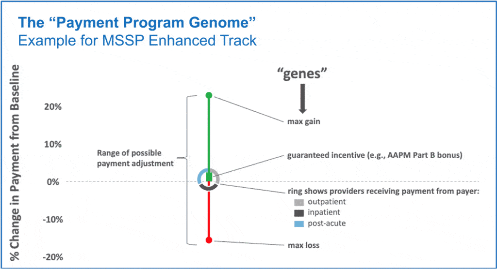
Figure 3
The length of the line is proportional to the possible range of payment adjustment, and the color of each segment of the line represents either an incentive (green) or penalty (red). The thicker green segment represents a guaranteed incentive not reliant upon program performance. There is also a ring with different colored arcs, each of which represents a different type of provider which may receive payment directly from the payer for that program. One could imagine variations of this language (“dialects”) such as using a different set of provider type categories to suit a situation. Or, one could enhance with additional language features, a few of which I present later below.
As a simple example, Figure 4 shows a set of Program Genomes for different tracks of the Medicare Shared Savings Program (MSSP). For additional context, the top labels indicate which alternative payment model (APM) category, as defined by HCP LAN, each track belongs to. Category 3 comprises APMs built on a fee-for-service chassis, whereas Category 4 is for population-based payments (capitation) and so on.
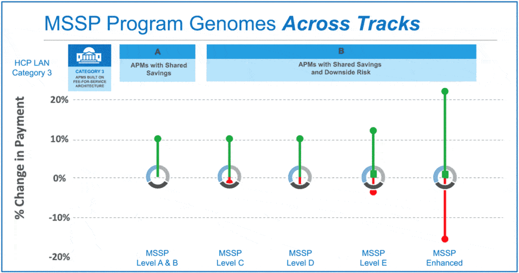
Figure 4
As shown in Figure 5 for MIPS, one can also visualize how a program evolves over time.
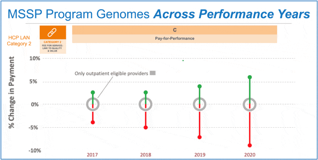
Figure 5
The possible benefits of this visual language become more apparent as the number and diversity of programs increase. There is a growing number of health systems selecting and managing 10 or more value-based payment programs spanning multiple payers. Figure 6 shows how one can quickly grasp the similarities and differences across multiple programs in a single glance without having to be a regulatory or financial analyst.
Such a visualization can also spark questions or thoughts that may not easily occur through the usual means of poring through thousands of pages of rules and regulations. For example, what program might be missing from our portfolio of payment programs? Why isn’t there a dedicated, higher risk-reward payment program for post-acute providers as there is for other provider types?
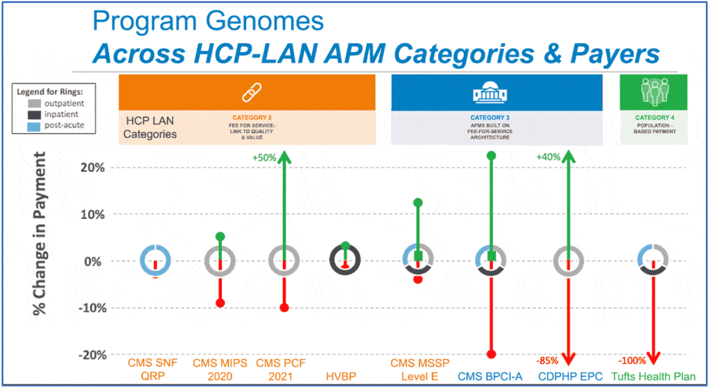
Figure 6
The Program Genome-based language could also be enhanced to address additional use cases, such as informing about the historical performance and provider composition of a program. Figure 7 shows one potential way to do that. The distance of the provider ring from the baseline (where the green segment meets red) indicates the national average payment adjustment, which is calculated for an increasing array of programs, such as MSSP and MIPS, based on public data.
The height of the ring itself could represent the range of payment adjustment corresponding to +/- 1 standard deviation of the national distribution. Finally, the relative lengths of the colored arcs comprising the ring could represent the relative proportions of provider types participating in the program nationally.
Once the basic elements of a visual language are established, such as the normal “rectangular bricks” in a set of Legos, then the broader community can find ways to extend and combine to apply to additional scenarios.
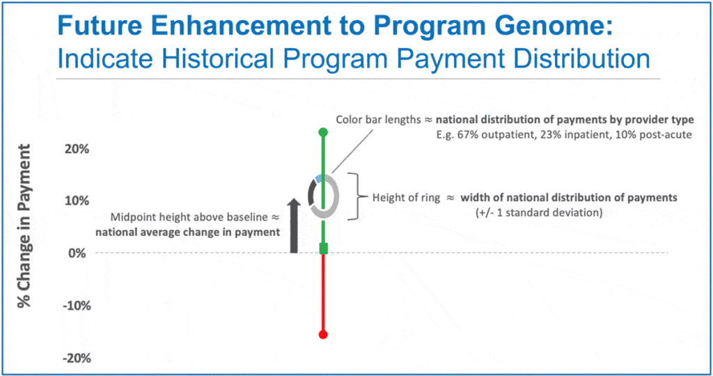
Figure 7
It is hard to say where this concept will head, and we will continue to engage our community to help discover that. Perhaps the larger point is that there needs to be much better ways of expressing the key features of value-based payment programs so that a greater range of leaders and stakeholders can more quickly and easily engage in meaningful discussions about program participation and design. I hope that this latest brainstorming exercise may play some small role in sparking more ideas.
This article was written by Tom S. Lee, PhD, Strategic Advisor to SPH Analytics, and originally published on the SPH Analytics blog. Azara Healthcare and SPH Analytics Population Health Division merged in December 2020.
About the Author
Tom S. Lee, PhD, Strategic Advisor to SPH Analytics, is a serial entrepreneur and leading expert in healthcare value-based programs such as MIPS, MACRA, Meaningful Use, and PQRS. He is the father of two small children and after a frightening personal healthcare experience, his concern for their future in the world inspired his work to drive innovation in the public healthcare system.
Tom is the former CEO of SA Ignite and a member of the Young Presidents’ Organization. He earned a Bachelor of Science with Distinction in Physics from Stanford, a PhD in Physics from U.C. Berkeley where he was a National Science Foundation Fellow, and an MBA with Distinction from the Kellogg School of Management at Northwestern University.
Learn More:
Azara Healthcare and SPH Analytics Population Health Division Announce Merger
Related Articles

From Oversight to Orchestration: How Azara DRVS Empowers Networks to Transform Rural Health
Explore Insights
Unlocking Value-Based Care Success: Why Supplemental Data Matters More Than Ever
Explore Insights